Go back

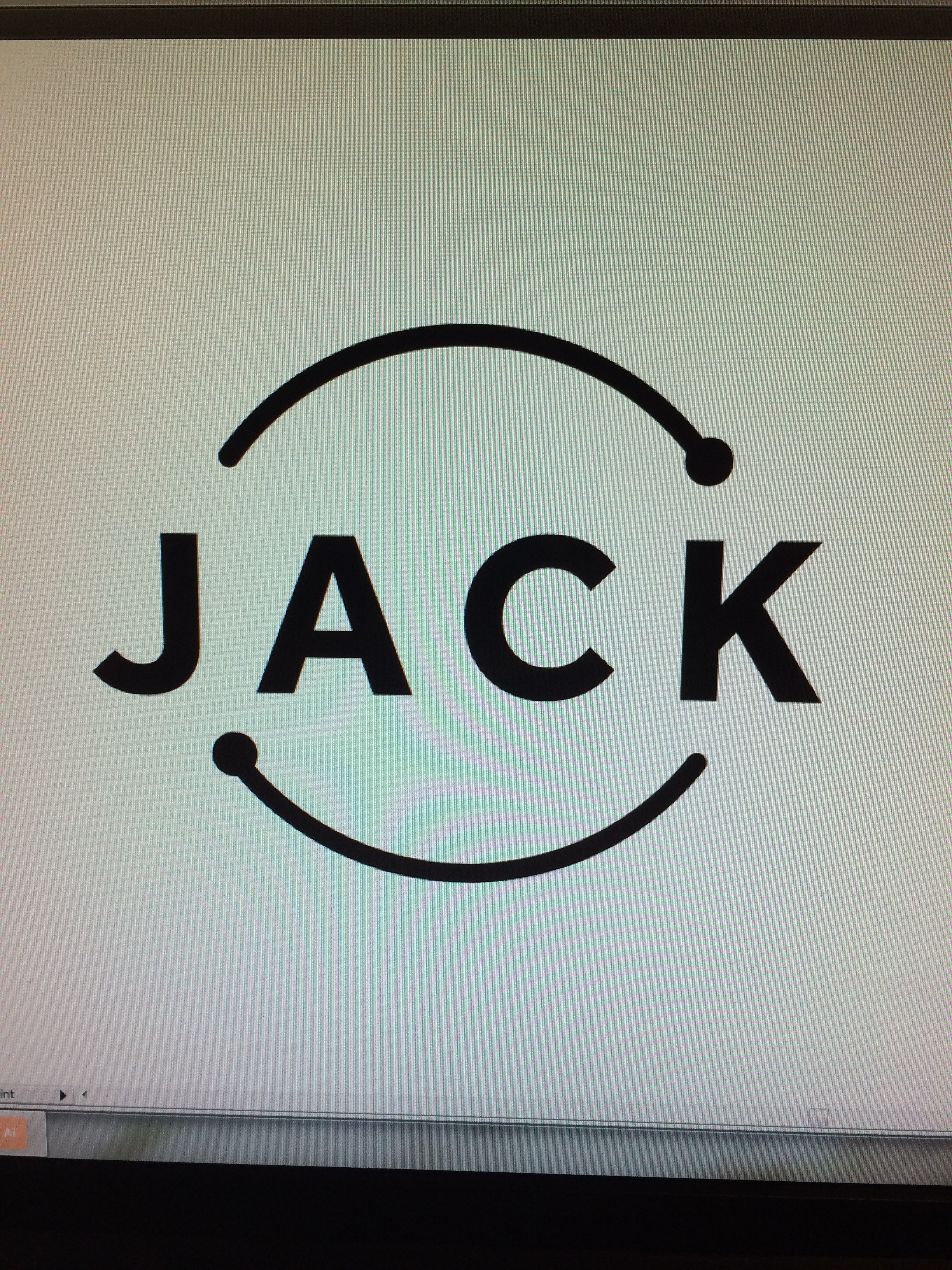
Alfa This logo represents the design process in its simplicity. It shows that as a designer I am constantly reinventing myself.
Bravo I dunno, I don't get that from the logo. Maybe if it was just the circle or just jack.
Charlie Koncept is very Hard to Understand.. And the Font is very very boring
Delta Hey charlie... What is it that makes the concept so hard to understand? And what makes the typface so boring? Giving critiques should be helpful. Yours isn't right now.
Echo Sorry seems a bit boring especialy for a designer logo, would make it less simple and more exciting
Foxtrot I am loving the feed back.. thank you I have another logo which I will post soon it breaks away from this design. It wasn't sitting right for me.
Golf What do the lines represent? It's just really simplistic and so it is hard to grasp what you mean with the two lines