Go back
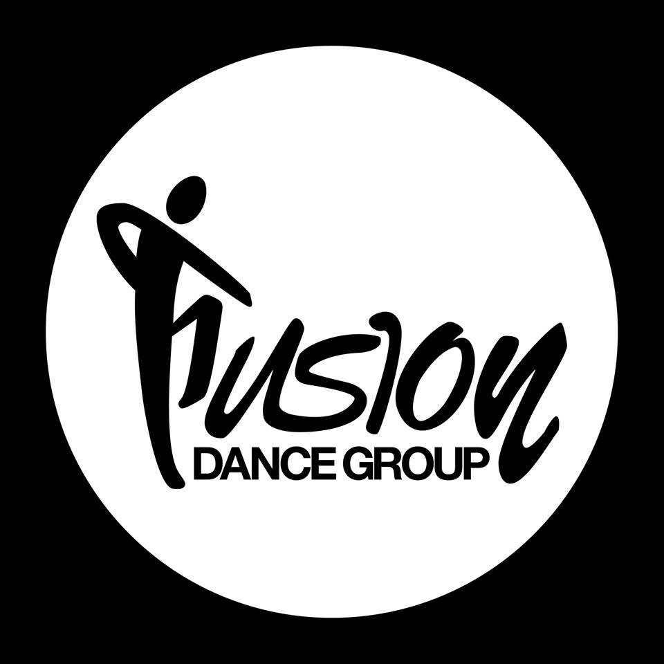
Alfa I posted the logo a while back, and since then I've had a bit of time to clean it up. I made the "F" out of parts of letters from the font to make it more coherent (I.e. the head is the dot of an "i").
Alfa Any constructive criticism is well accepted.
Charlie Consistant line weights would be nice
Delta Very cool. Only suggestion would be to try pulling the bottom of the "u" up a bit so there is a nice even curve from the F down to the S.
Echo Give that Helvetica some breathing room! It looks like the words are choking.
Foxtrot Using head as dot does not work. And overall the flow of style does not represent the brand. (Dance group) looks more like karate.
Golf Sorry looks a lot like the zumba logo...
Alfa Yeah I guess it does feel like karate/Zumba. Client was happy, and it was a very minor thing, so maybe when they do a serious overhaul I'll keep this in consideration. thanks for the tips.