Go back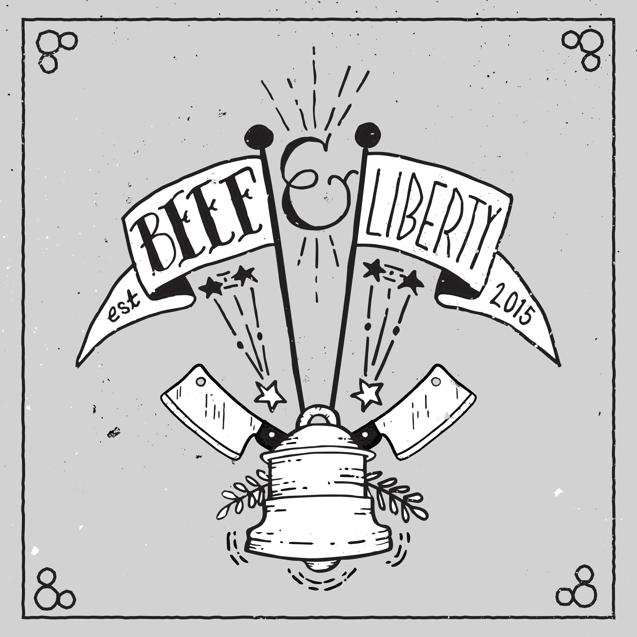
Alfa Beef and liberty should be the same weight I think.
Bravo Looks great
Charlie Same weight def
Delta Yep weight
Echo No I like the different wieght. I get the concept.
Foxtrot It bothers me too that beef and liberty are different. My problem ist that these two typefaces do not work well together. Is that the concept?
Golf Well I actually pulled font inspiration from Art Deco fonts of the 1930's and early tattoo fonts that were originally made popular by Sailor Jerry in the 1930's. So two conflicting fonts of the same era.
Golf Beef being Sailor Jerry and Liberty being Art Deco. Beef was supposed to be informal, and Liberty formal.
Bravo Ignore everyone, it's great. Seeing the progress was awesome,
Foxtrot I like the information. Thanks for that. The comment above me was unnecessary. No one tried to hate.
Golf Thanks everyone! Designers need to collaborate and flush out ideas, so this has been a fun way to create this thing and get feedback!