Go back
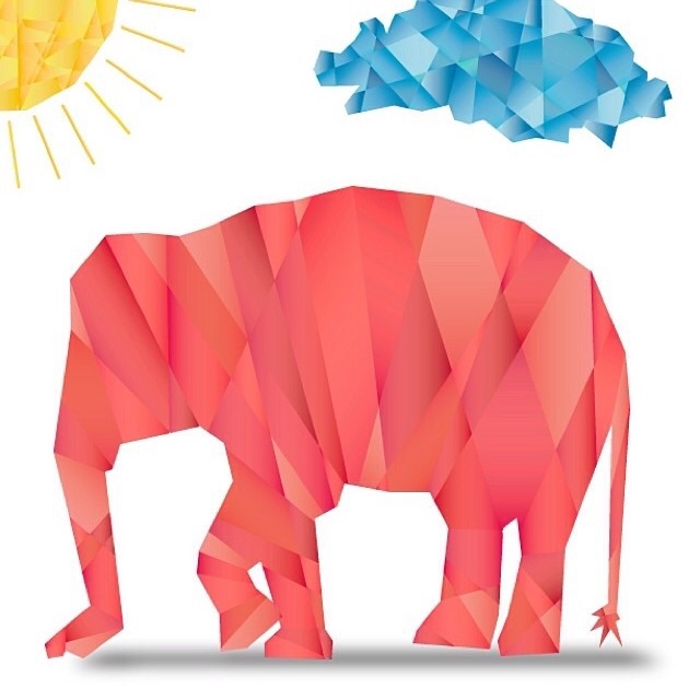
Alfa The shadow and the feet need a little more tweaking.
Bravo I would almost get rid of the shadow.
Charlie I agree with the posters above. I think the design is stronger without the shadow!
Alfa Oh an one other small thing. The rays of the sun. There is a better solution for that. Other than that. It's 'cute'.
Echo Create the shadow with the same texture as everything else.
Alfa ^ :) that's what i thought, i just figured the designer will figure this out on his/her own. :)
Golf Kinda looks like broken glass, could use some smoothing up