Go back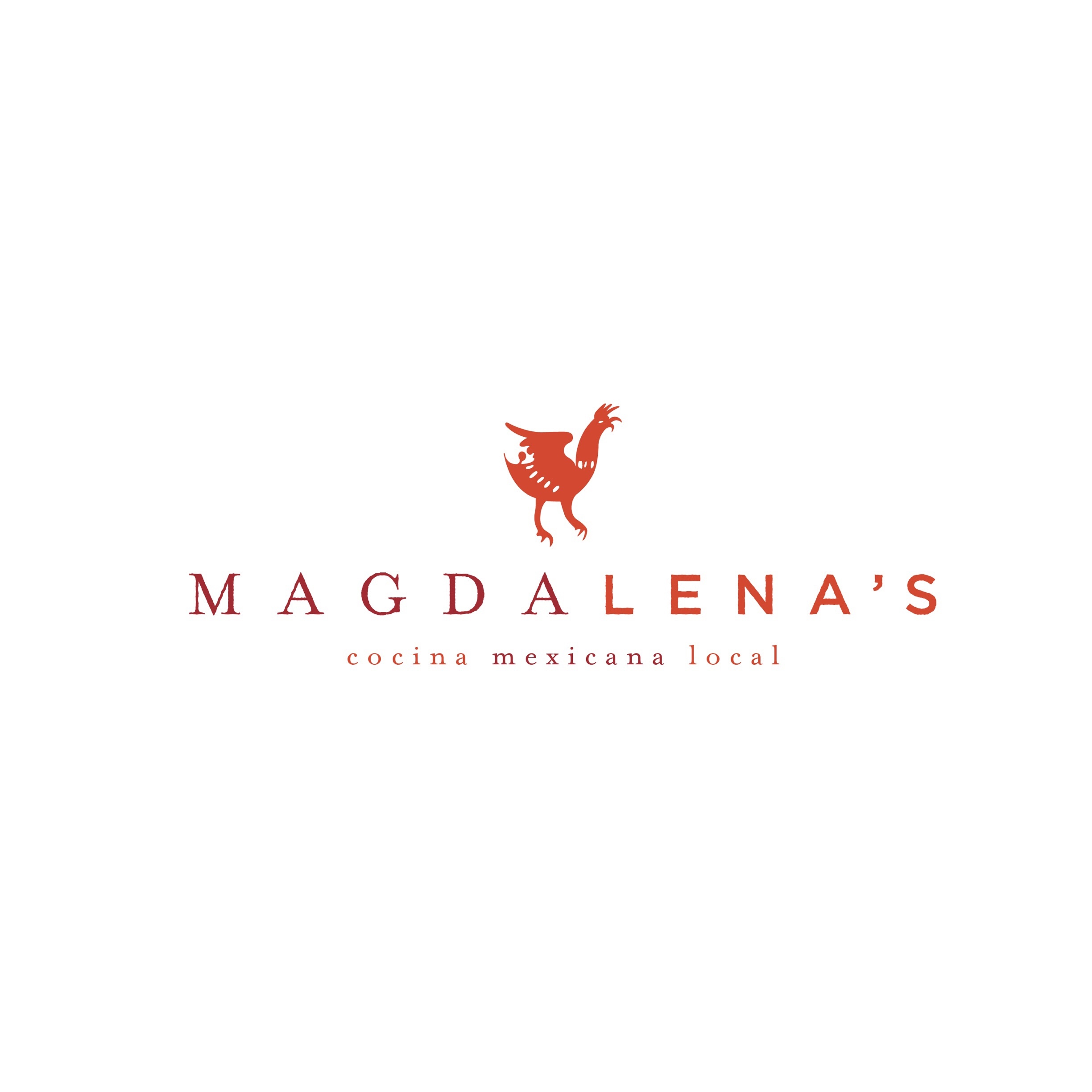
Alfa Thanks for posting the logo. I like it clean and simple. A recommendation for a tweak just to see how it looks- have "lenas" same maroon color just bold, and make "Mexicana" the same red orange as the logo.
Bravo Cool. I'll try that out. Its for a restaurant doing old, authentic, interior mexican recipes with modern technique and presentation so hence the classic serif vs modern in the name. The color duality may be too much.Thanks
Charlie Really impressive- contact info?
Bravo Hierarchysf.com
Wait for it....my site needs to be updated. But for real. Hey, it's new to you though!
Echo its all cool but I wouldn't mix fonts that way?
Bravo Yeah but that's part of the story. It's his grandmothers old recipes passed down through generations with a modern twist so it metaphorical. Normally I would advise against it too but I think it works in telling a story
Golf I truly love the simplicity! Maybe try blending the maroon into the orange instead of changing the color of 'lena's'??
Charlie I wish I could vote twice for this one
Bravo Aaawwww, thanks!