Go back

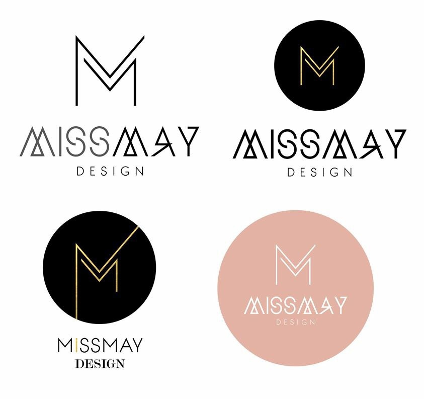
Alfa bottom right, but they're kinda 2 logos in one.
Alfa Yea, I'd either go with the M and just a basic font of missmay under it or lose the M. the whole thing in the circle is nice.
Charlie You need to tie the whole thing up better, it feels disjointed. Bottom right.
Delta While the M and the font are great, together there's Too much going on - needs something to ground it.
Echo Don't use circle