Go back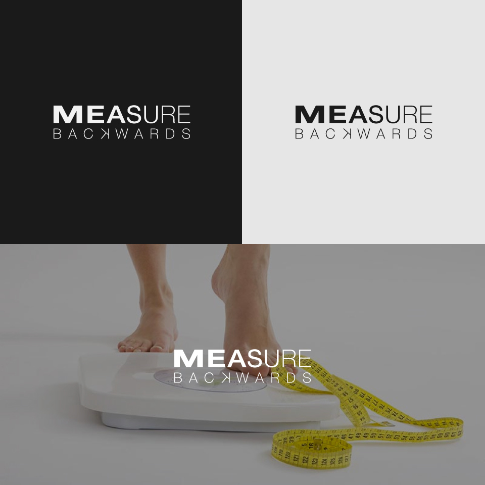
Alfa This logo is for a weight loss program. The weight of the font gets smaller as it goes down. Simple clean typography.
Bravo I’d do something else with backwards, maybe thicken it up or don’t justify it. Backwards K seems like overkill too.