Go back

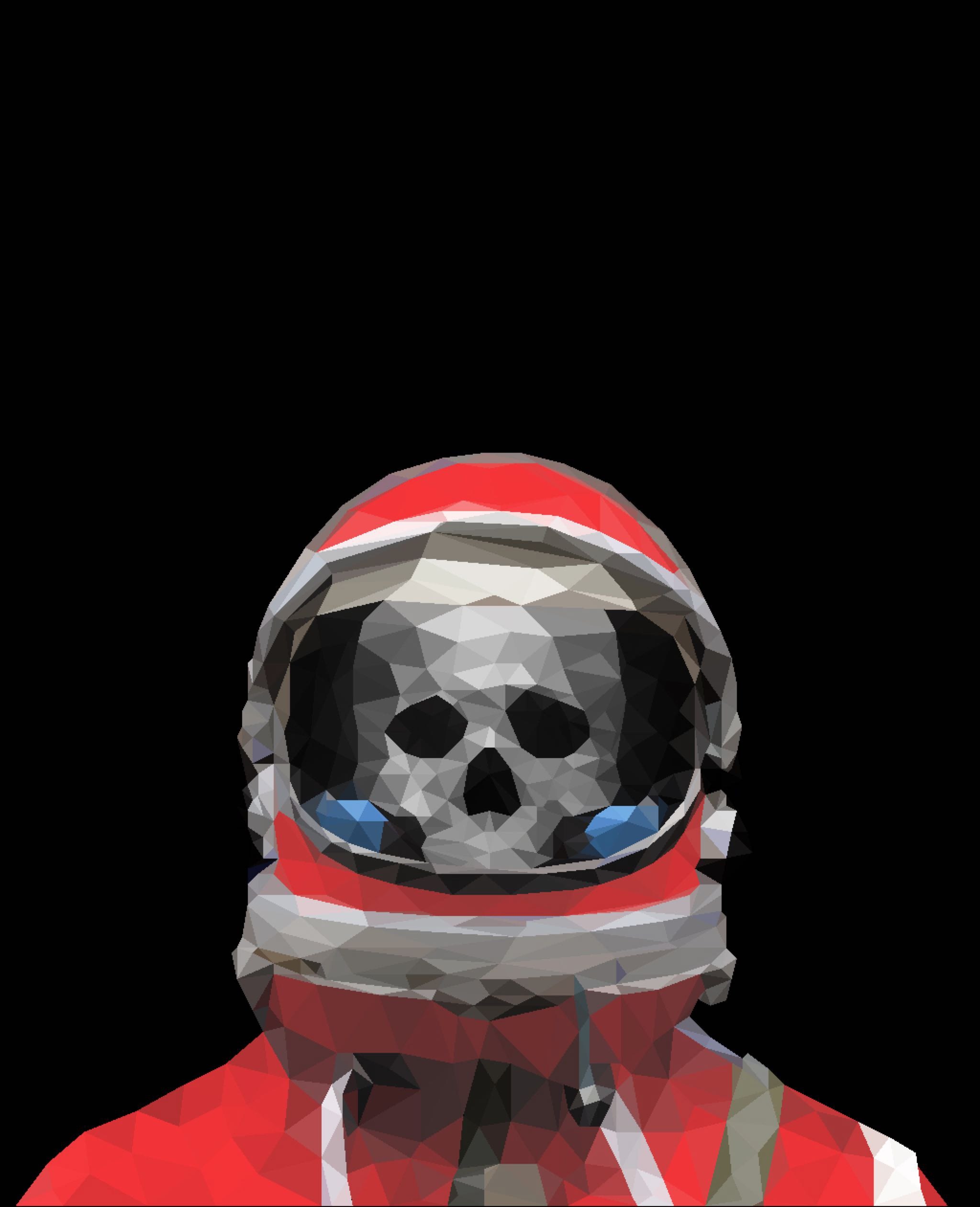
Alfa Work in progress for a sci-fi book's cover, how can I make it better?
Bravo The skull could use more of a shadow so it looks inset
Charlie Try to put a little more depth into the skull and it would be nice work
Delta I agree, looks great just the skull needs more depth
Alfa Thank you all for your help