Go back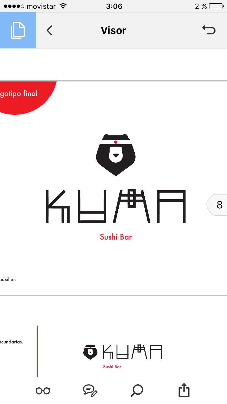
Alfa The font could be a tad thicker to match the bear
Bravo The bear is really nice. The logotype is unique but it overpowers the bear. It's too much with both of them. Maybe tone down the type?
Charlie Thicker font and it will be perfect