Go back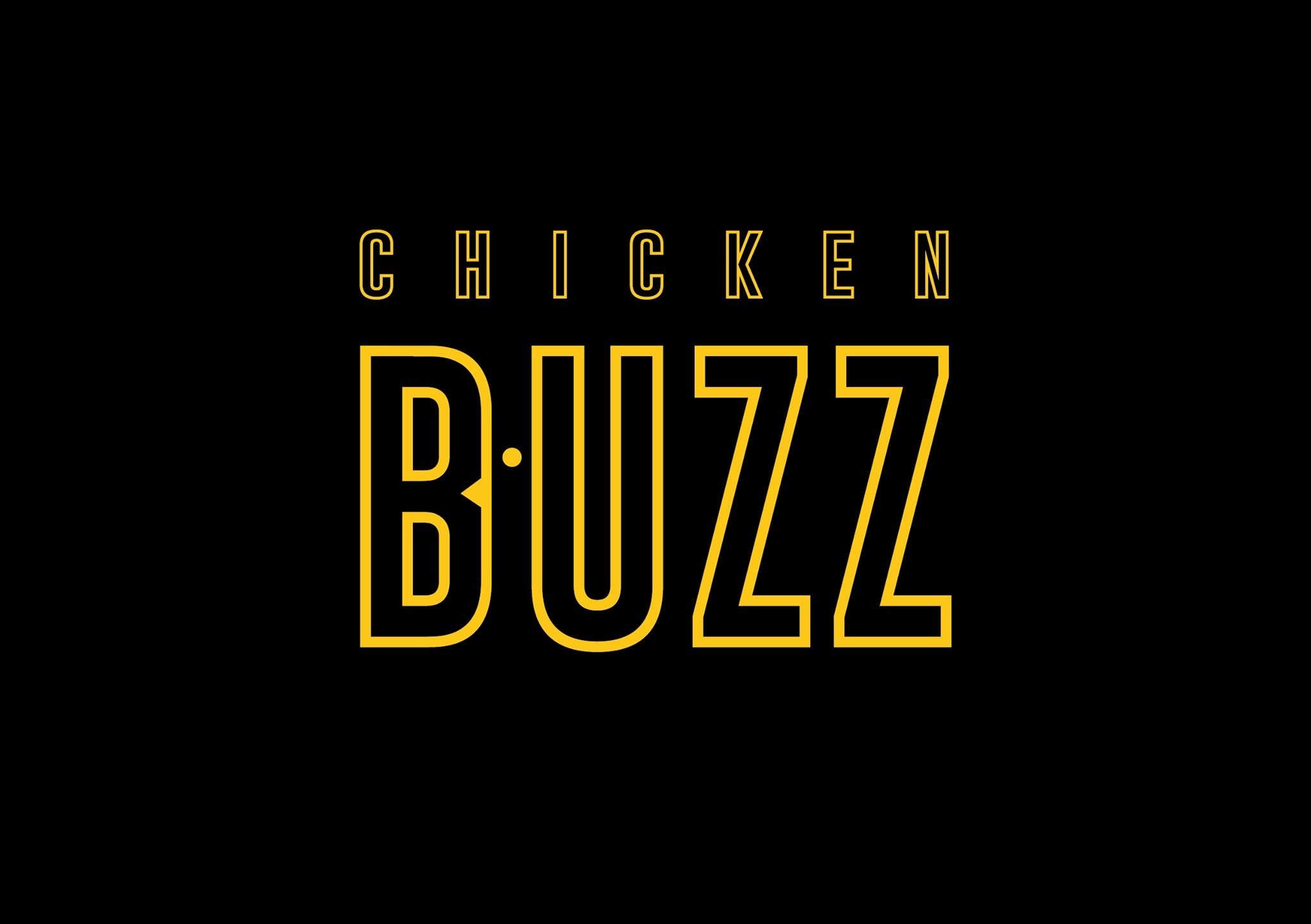
Alfa The dot should move down to meet at the middle of the letter B
Bravo It wouldn't look like a chicken then.
Alfa It doesn't look like a chicken anyway
Charlie I gave you a thumb down but ment the other way. I enjoy the concept! Somehow you should play around with the spacing or the size of the eye. Appares too tight.:/
Delta I didn't see the chicken til you told me.
Echo Same here, couldn't figure it out
Charlie Example fedex logo... Is subtle and therefor great. But that's just me. I would stick with this concept.
Echo Maybe put a white bar in the middle to put the chicken more into shape... but that's just me
Foxtrot it looks ok, nothing grande. But that's just me
Golf where is the chicken? cant find it
Bravo Between B & U
Hotel Really cool concept. I feel like its half way there.. try playing with the negative space more.. maybe it needs a secondary 'chickeny' feature like the gobble neck
Hotel Or a wing? Dont use a condensed font so it sits lower and the body can curve around under the U