Go back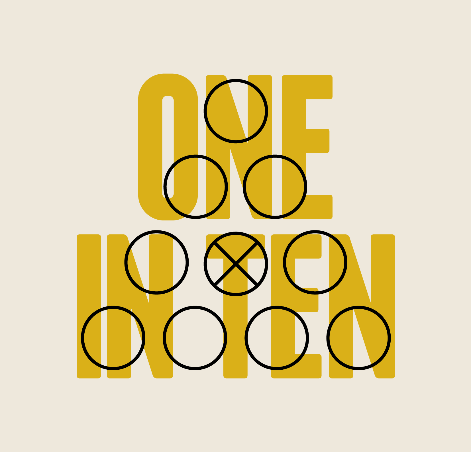
Alfa I like the layout, maybe lighter on the circles, hard to read the text.
Bravo Either drop the circles behind the text or lowere the opacity, but apart from that I like the meaning
Charlie Plus, you should align the circles to the text. Look at the bottom and the top. Not symmetrical. Also, i think it's not good. Not creative, no design. You should make a completely different one