Go back

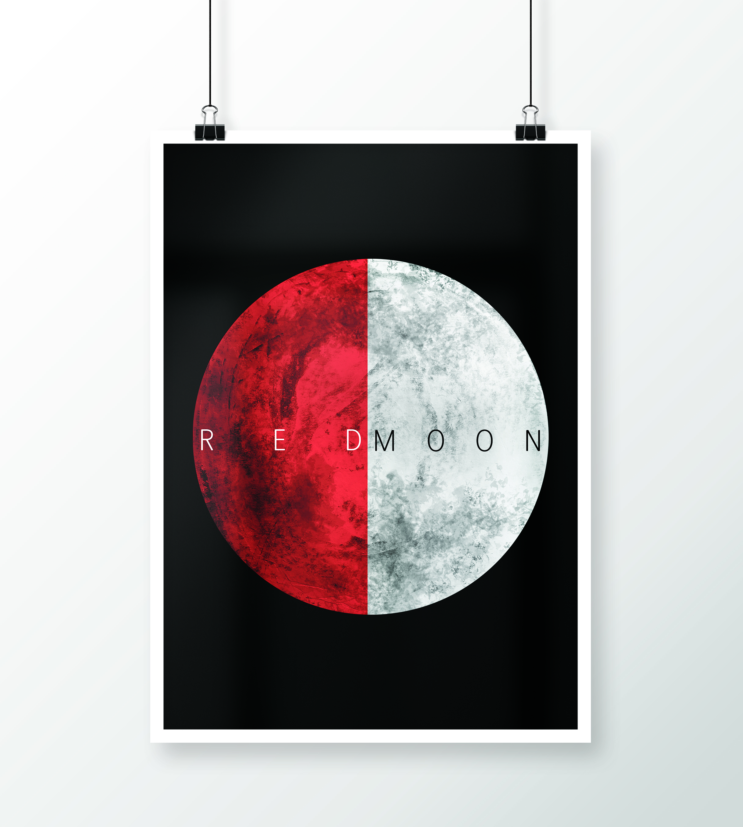
Alfa The D and M are too close
Bravo I agree with Alfa
Charlie I think the D and the M make the words "red" and "moon" seem more like dualities rather than one describing the other.
Delta I like it with the D and M this close. Very cool design