Go back

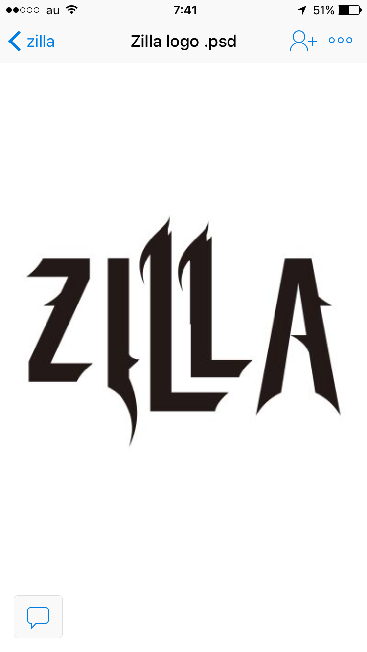
Alfa Cool, very metal.
Bravo The A looks a bit disconnected from the the other four letters, which seem to flow nicely together. Maybe you could have it fit in with the L's better?
Charlie Thank you . I'll try and align them somehow .
Delta The edge curves should all form around a singular shApe or the shape of the letter beside. Honestly it's just random circular shapes overwise.