Go back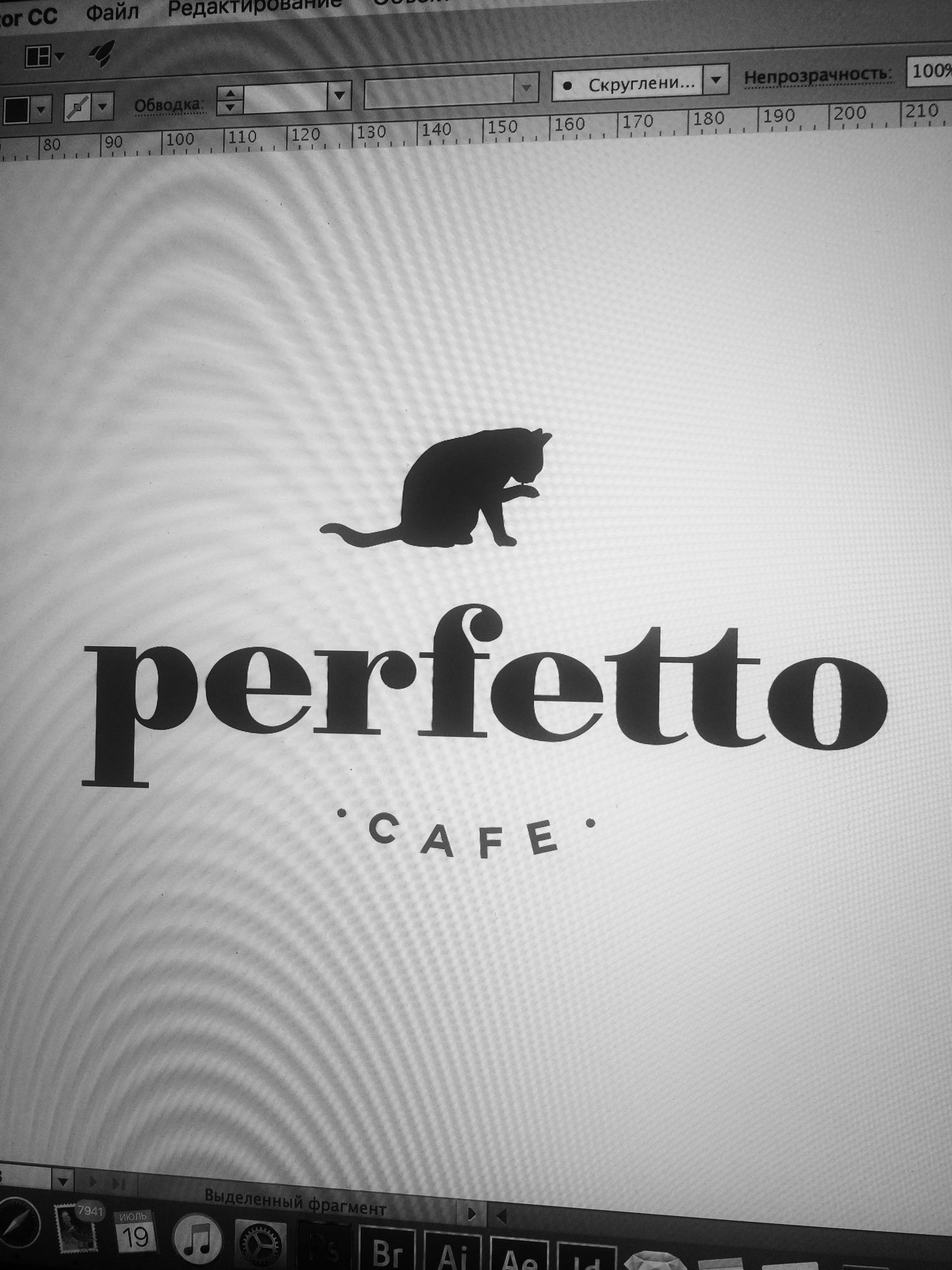
Alfa Nice, but why the cat?
Bravo @alfa here is no deep concept, just client's vision of this symbol)
Charlie Don't mind the cat, makes it look like a friendly family run cafe, but it's kind of floating on its own up there. Needs better integration with the type.
Delta The cat isn't centred . I agree it should be integrated with the logo. Right now it's just slapped on as an icon. However I'm not sure a cat licking itself makes me want to eat there.
Echo Maybe the cat could be smaller and sit on the F
Foxtrot For me the cat is just an object placed randomly. It isn't even aligned properly, if i where you i would integrate that cat more with your wordmark. And why the cat, are there cats in your cafe if not i would choose for a different icon.
Golf Good work. Forget the eternal why this why that. It's a cafe, it's confortable, it's slow time ambient but cosmopolitan. Just like a cat. :)