Go back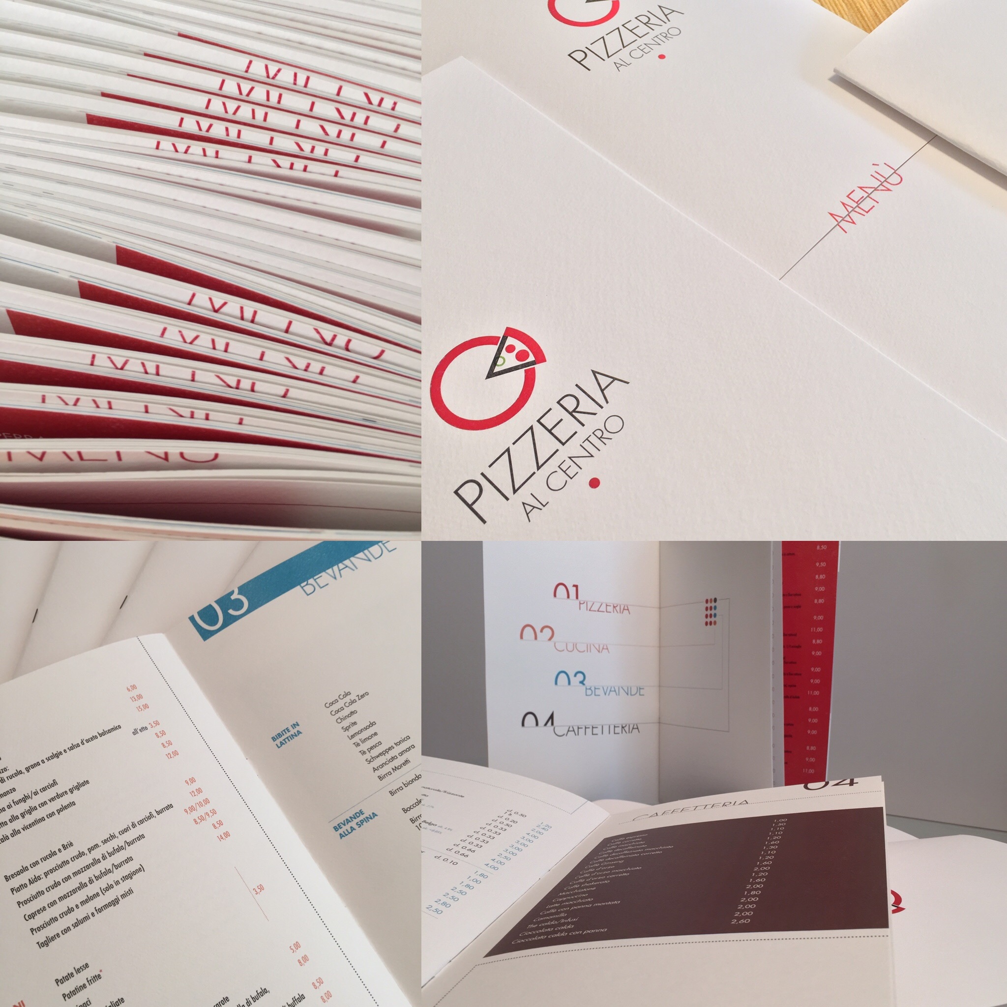
Alfa It's nice, but it's a little sparse in places. I would look for playing out with a complimentary typeface or even altering the weight of the font for emphasis in places to draw attention
Alfa Also for the logo, it's a nice concept with the slice of the circle. I think there's too much detail, find a way to work without the thick black line of the slice, look for utilising white space for design
Bravo Thank you!
Charlie My impression... A high end pizza chain. Looks a bit clinical. Not that there is anything wrong with that. It does give me a good feeling about a clean kitchen and thats good especially if its a chain. I'm curious, what's the target audience?
Bravo Thank you a lot for your feedback! The target audience is wide, the place is frequented by people of all ages and social class. This is why I chose to work in a simple way, to make everything very clear and clean and at the same time to give a modern twist according to the current aesthetic of minimalism that was also a key point of the brief and renewing the corporate identity.
Delta So minimalist. Perhaps too minimalist. I'd assume the pizza may come with minimalist toppings