Go back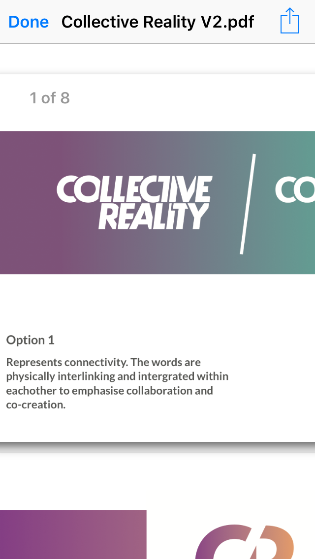
Alfa Logotype, London, festival, reality,
Bravo Bettering, some of the gaps seem like they're different thicknesses
Charlie Love how each letter plays off of the other
Delta Nice. What if
Delta Nice. What if the Layering of the ITY were reversed so the I was on top of the T and the T above the Y.... I think it would give. A better horizontal flow
Alfa Thanks I had considered that but the client has accepted now!