Go back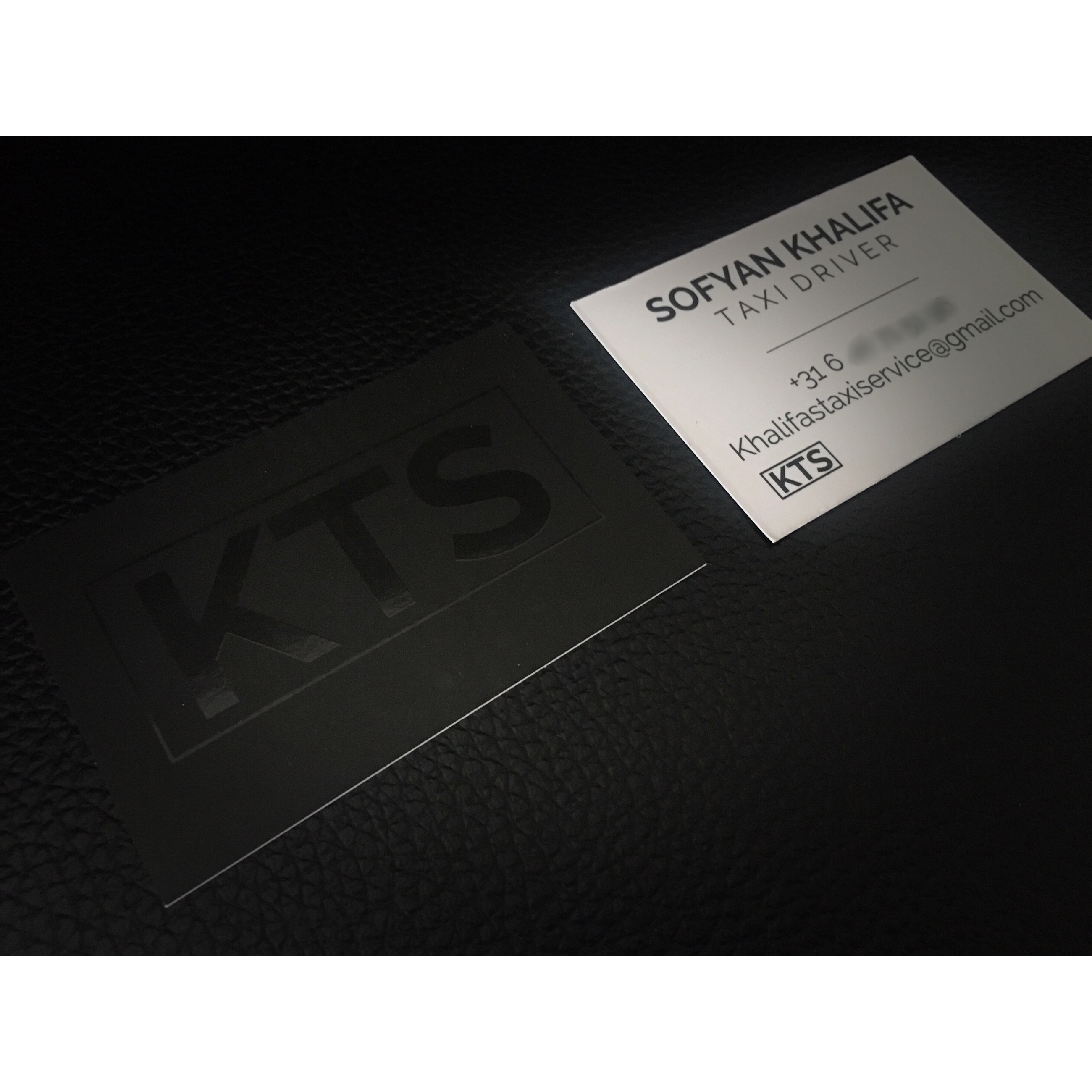
Alfa The spot uv is a nice touch, but the back of the card needs work typographically. It's taking up too much space / too large. Look for ways to explore typography without centralising everything too. Also the small version of the KTS on the back doesn't work and isn't necessary