Go back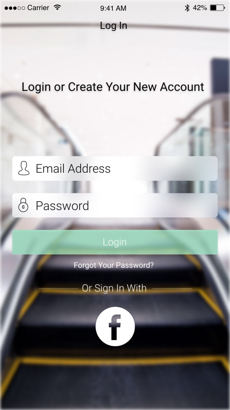
Alfa Nice and clean. A cool ux touch could be to code the 'login' bar to change colour when both valid email and the password bar have been filled :)
Bravo I'd just say that the word "login" is a little hard to read because it's so light and there is not a lot of contrast between its color and the button color.
Charlie Email and password show probably be lighter since they're placeholders and make login the same size as the fields