Go back

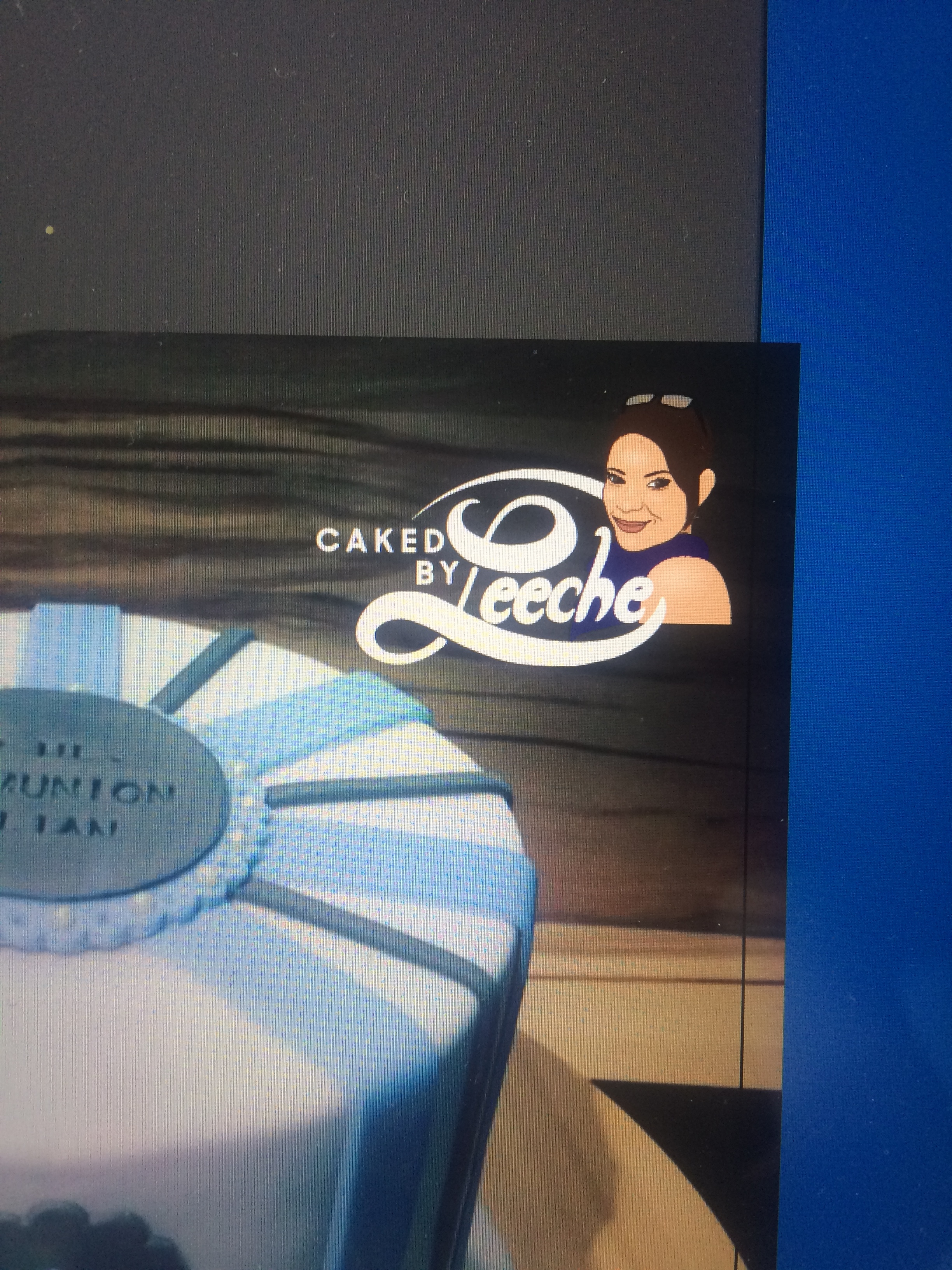
Alfa Unfinished - thinking about combining the Face I roughly illustrated earlier with lettering I am designing now. Please criticise whole picture + lettering. I know it is not fitting together yet but I am not sure how I could combine both elements so that they look nice. or should I leave them separately?
Alfa The pic in the background is only to show where the logo will be placed later. The girl is making cakes and uses it to show them on Facebook
Bravo The lettering could be more polished. Looks a little too hand drawn and is almost running together. And I'd probably do one with and without the girl.
Charlie I feel as the style that he girl is drawn is too detailed. Think more of the style of a stencil or an icon. Simplify it.
Delta Why her face in the logo? Leave that to real estate.;) i really don't care how the baker looks as long as the cake is good. Also to me it always seems a bit self centered and would make me wonder if she would listen to me and what i want.
Echo Yeah I want to have two versions of the logo, one with and one without the face. With face would be used on her website but not on all the Facebook Images of course
Delta But why does it need to be an illustration of the cake maker? I see no benefit in it. Just use a professional photograph. Looks much more pro.