Go back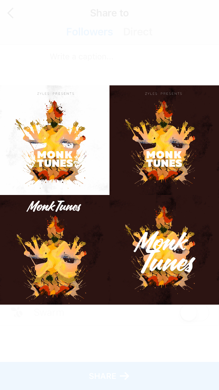
Alfa Just some more progress...
Bravo Top left. Maybe the top right f the font was brown. The sans-serif font is definitely the way to go.
Charlie Top left is my favourite. Like the bottom right too but I think the complex type ontop of the complex illustration is overkill. The simple block type on the first one with that illustration is killer