Go back

Alfa Is this for listirine, as in the mouthwash?
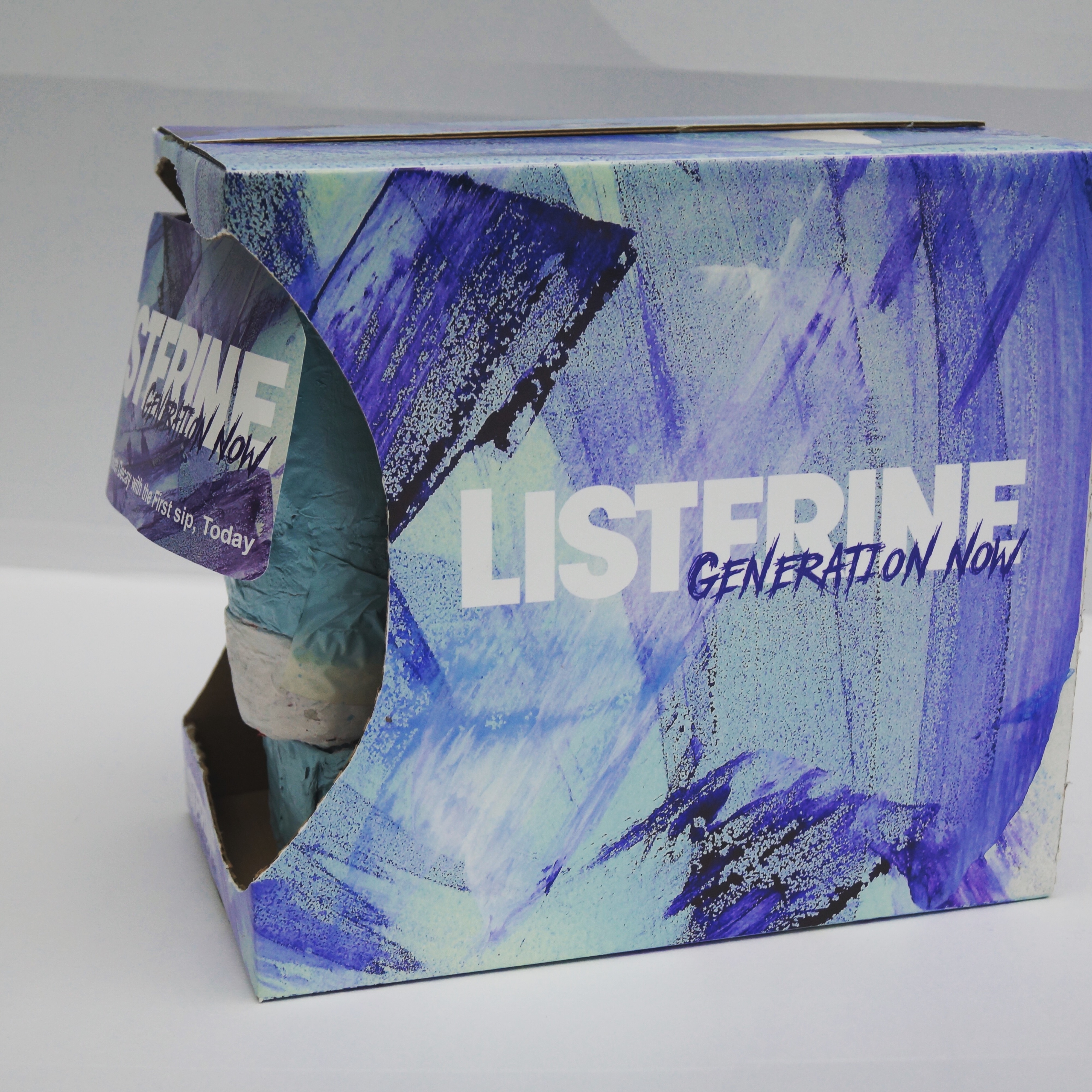
Bravo The look seems very incongruous for mouthwash.
Charlie Yes the mouth wash, is it just the texture and the colours or something else you feel that way about?
Bravo The texture - I wouldn't want my teeth to feel like they have that texture :) the teal and light blues work. The dark blue and black seem too heavy and "dirty"
Charlie I see what you mean I created the texture naturally with paint on Water colour paper and didn't edit it in any way just straight scan and Print how would you recommend changing the colours of the darker parts?
Bravo I don't think it's the right pattern. Water colour paper by nature is textured. Clean teeth are smooth and fresh. Not textured and grungy. Nice texture. Wrong product.
Charlie I agree with that 100% thank you so much for you imput 😊
Delta Agreed with bravo - nice design, but it doesn't say "fresh". The grunge design might better suit a hair gel or something.