Go back

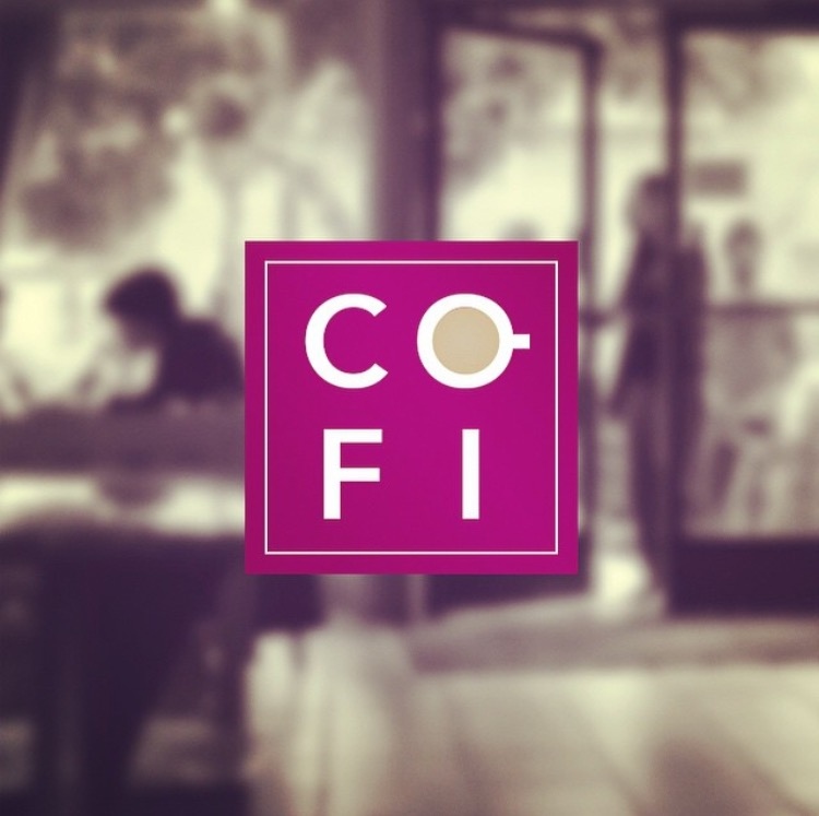
Alfa Nice idea. But it feels like it needs some more finessing. I think the choice in typography could be better. And is there a reason for it to be stacked in a box like that? Might look better if it was in one line. Or maybe the box represents a cafe table? In which case you could push that idea a little more.
Bravo I really like it