Go back

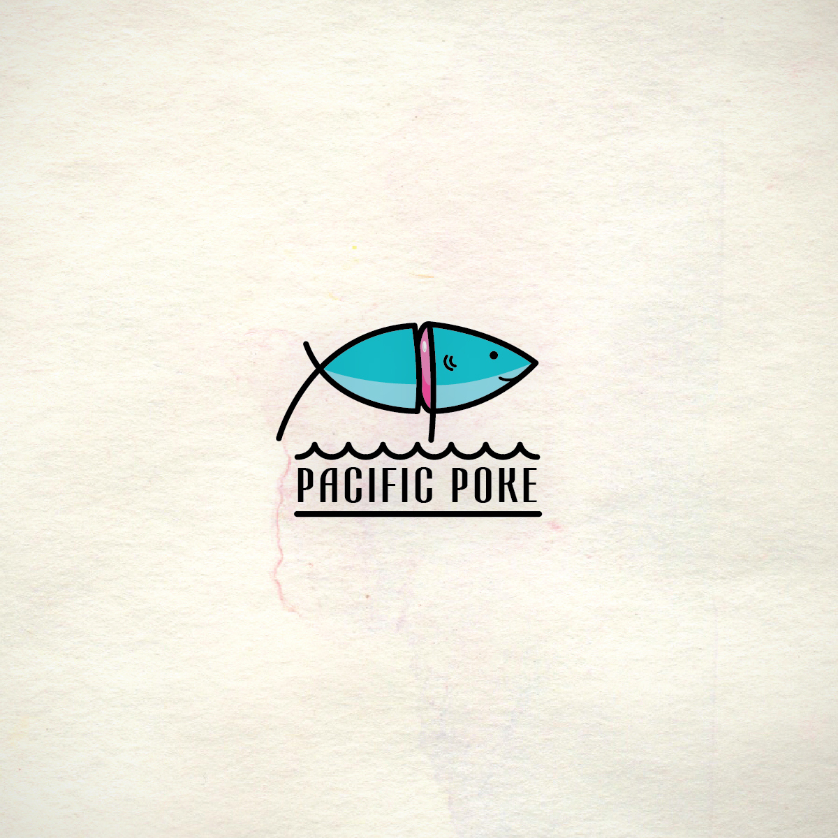
Alfa Nice! I'd say add a dorsal fin to the top and lose the watercolour texture as it's not necessary. Looks a bit sinister with the blood dripping down the tail of a happy fish!
Bravo Cool, maybe make the cut lines have a little more curve to give it a little more roundness
Charlie Thank you for the feedback guys. The background was placed just for presentation purposes. The part of the tail dips lower because I intended to make the fish include two letter P's for pacific poke. Keep the feedback coming! I appreciate it :)
Delta The P P idea is cute
Echo Nice idea but not obvious enough! Didn't get this until you mentioned it. Would a more simplified version work better to make the PP legible?
Foxtrot Very cool