Go back

Alfa I dunno man
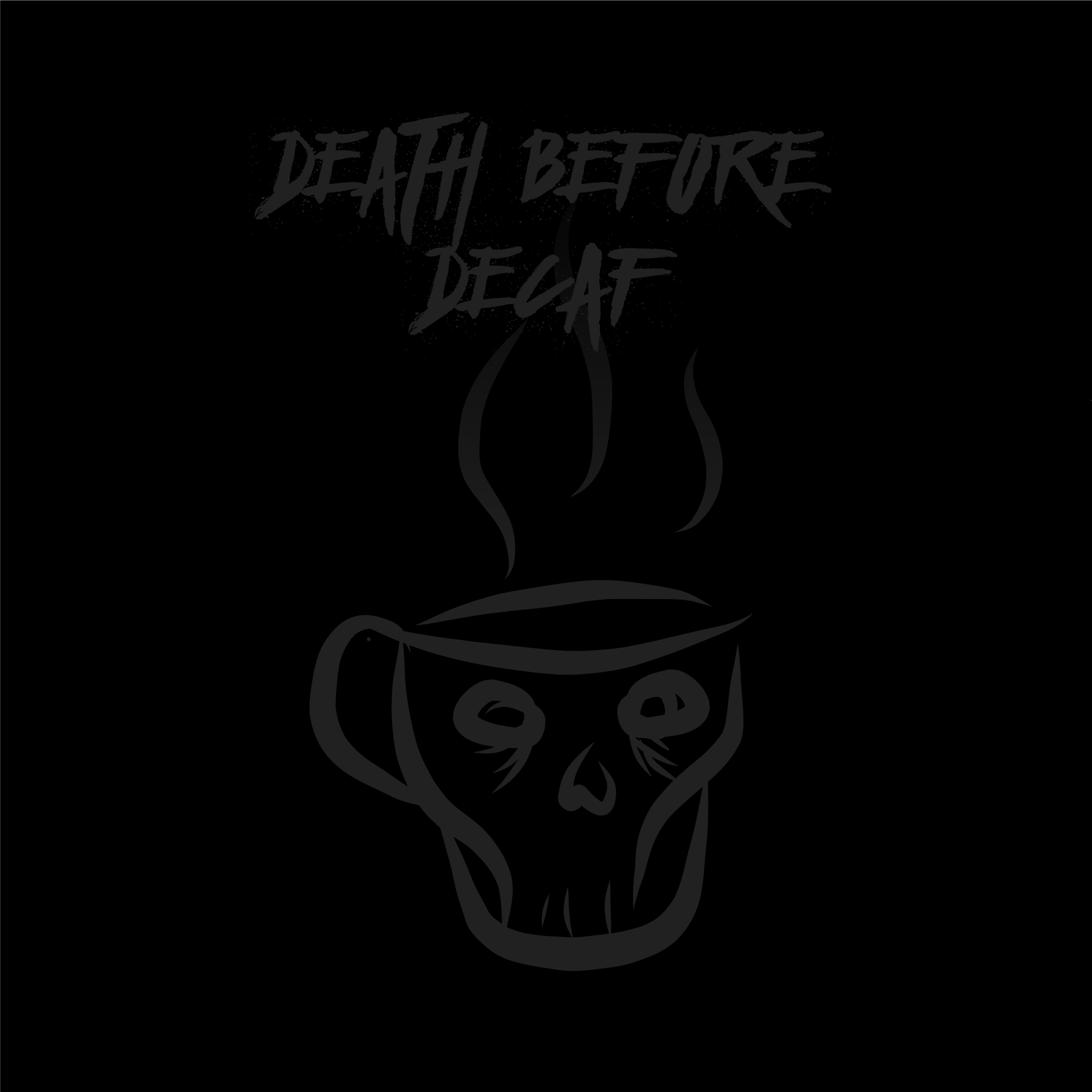
Bravo Concept is fine. Execution not. Contrast, selected typeface, mug, steam, and layout could use some love.
Charlie Agree. Love the skull as a mug, but a new typeface would definitely help. Perhaps the steam interacts with the name?
Delta Thanks for the critique! I was trying to veer away from my usual very high contrast choices, and it's good to know I overshot it. I LOVE the idea of having the steam and text interact!
Echo The contrast needs a bit of a bump. I like the type but to doesn't seem to align with any elements of the mug or steam.