Go back
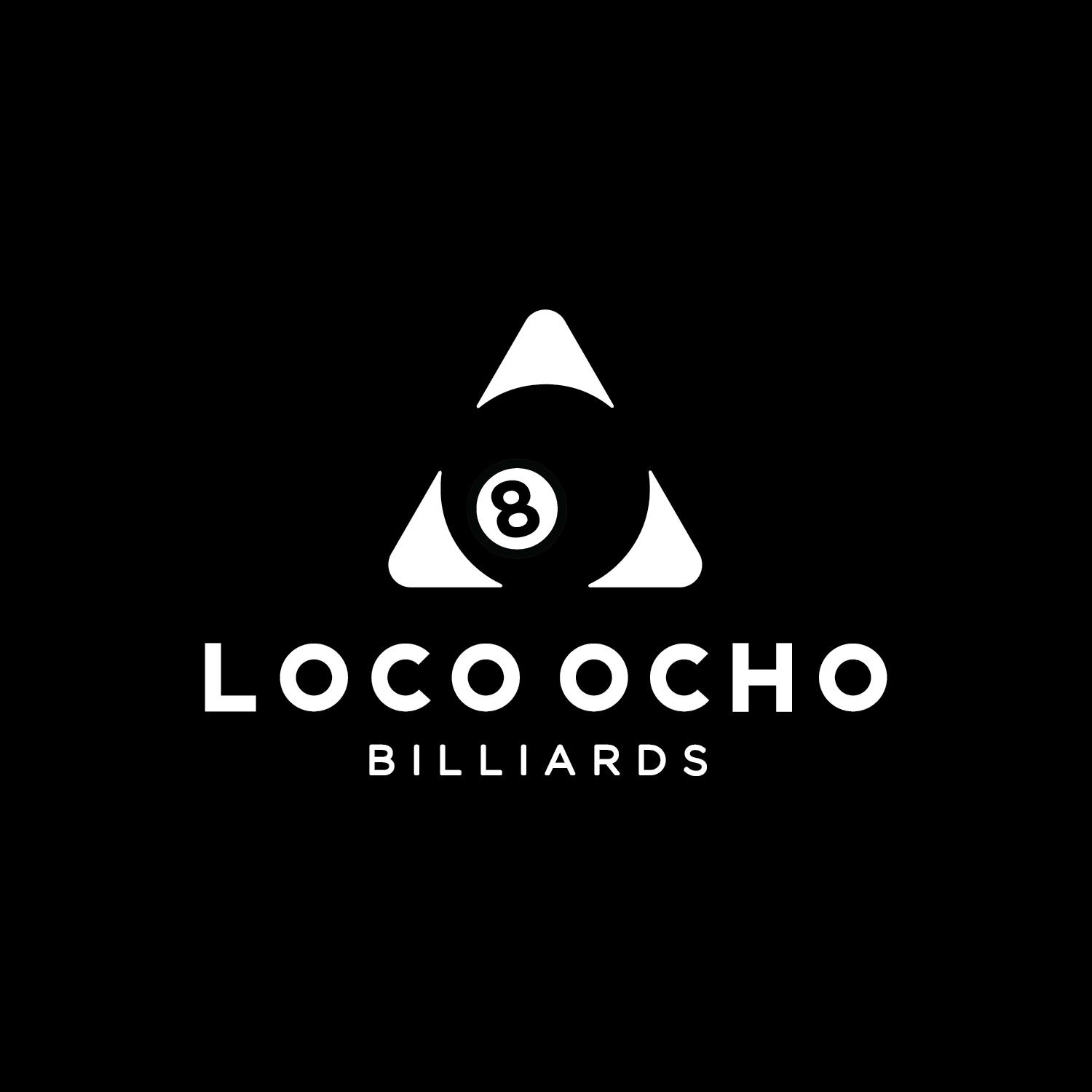
Alfa I like the concept, the kerning could be tighter and a more distinct space between the 2 words would help with readability.
Bravo I think you could play with the negative space and push it even further....ie enlarge the 'ball' even more to reduce the White. I disagree with kerning the letters in - you need a bit of breathing space with a heavy all-caps typeface. I agree with the space between the words though. 😀
Charlie Is it 'LOCO OCHO', or 'LOCOOCHO'? If it's two words they need to be separated, if not they need to be joined more.
Delta Try it in reverse. Not always you will get a sold black background
Echo Really solid concept!
Foxtrot I love it!