Go back
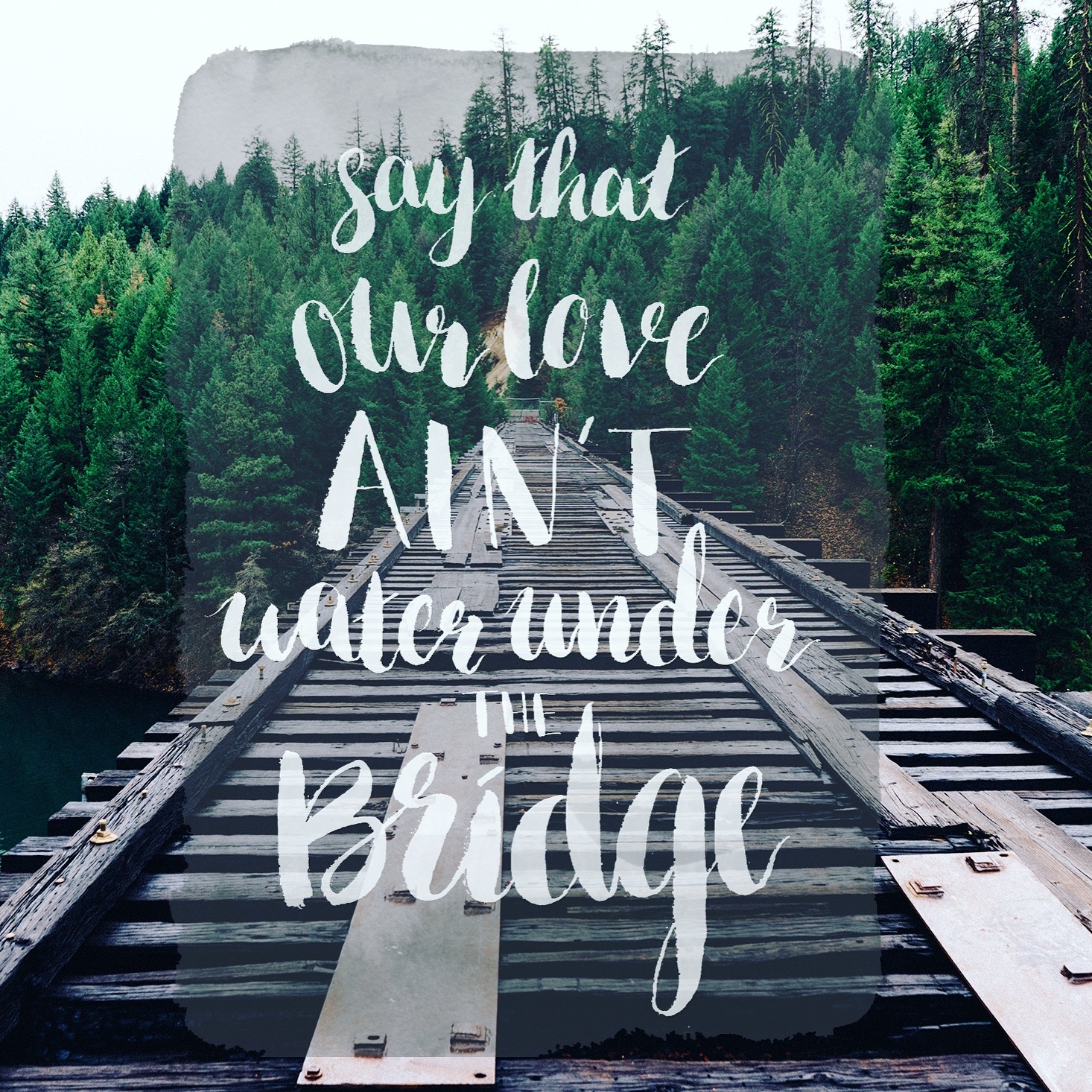
Alfa Would be cool if you blurred the background image a bit and overlayed it with black or something. Just a thought!
Bravo Yea, It's hard to read.
Charlie Agree.... Loose the texture behind the text, blur the bg image and reduce the size of the quotation. 🙂
Delta Adele yasss
Echo Cool, but this font and look is so overdone...
Foxtrot For the love of God, can we all agree to stop using these fonts?