Go back
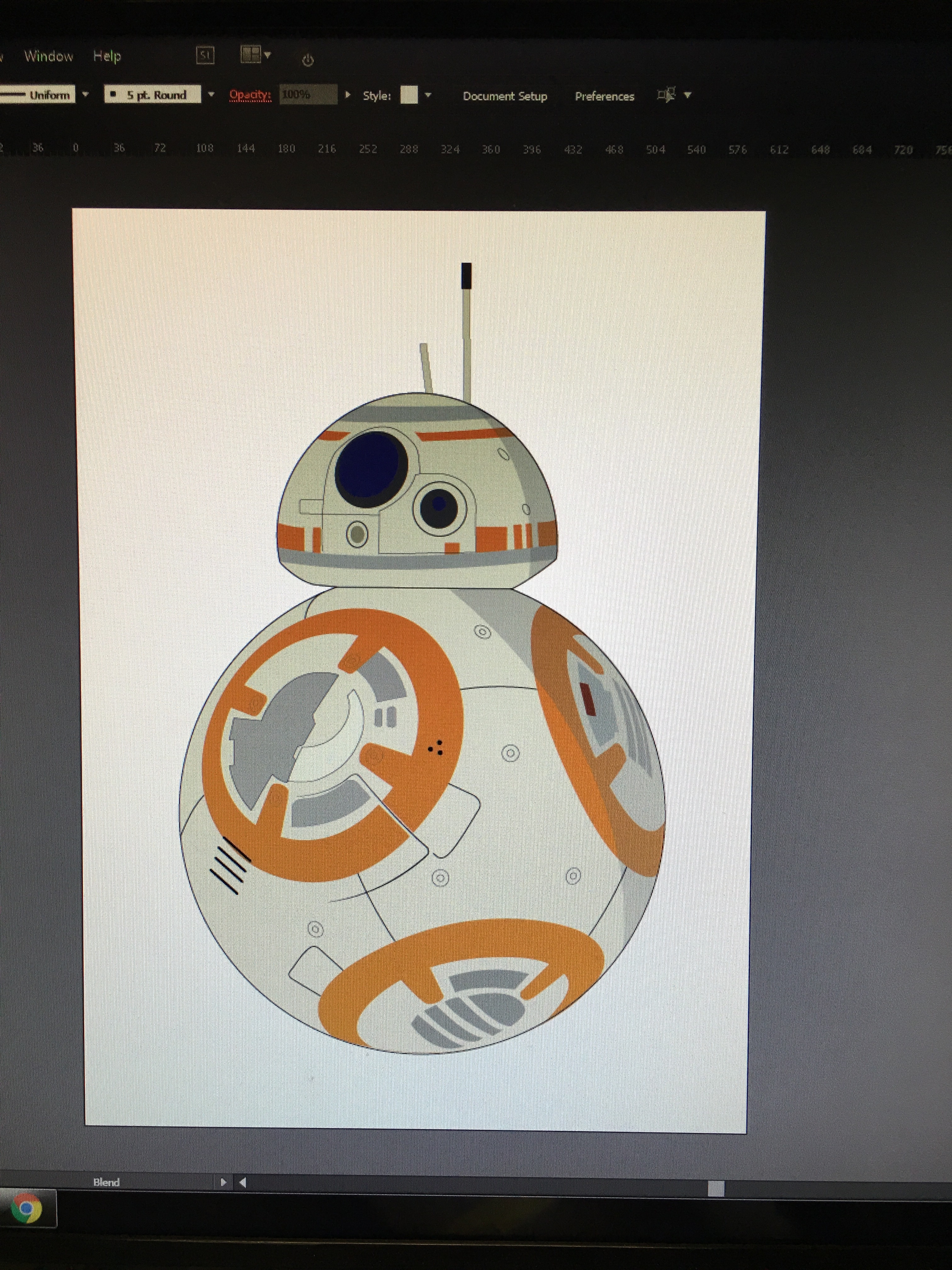
Alfa Pretty happy with the final product seeing as this is the first thing I've ever finished on Illustrator. Any feedback is welcomed!
Bravo That looks great.
Charlie Pretty cool, are you using it for anything or just for fun? Do the two shadow align correctly?
Delta Work on lighting and shadow in the intersection of the two spheres (the neck) - as it currently looks as though they are fused together. Also, the perspective Isn't quite right on the grey horizontal line above the 'neck'.
Alfa Sweet thank you guys! This is the first project I've ever started and finished on Illustrator. This will be used in multiple newspapers. And I'm not entirely sure.