Go back
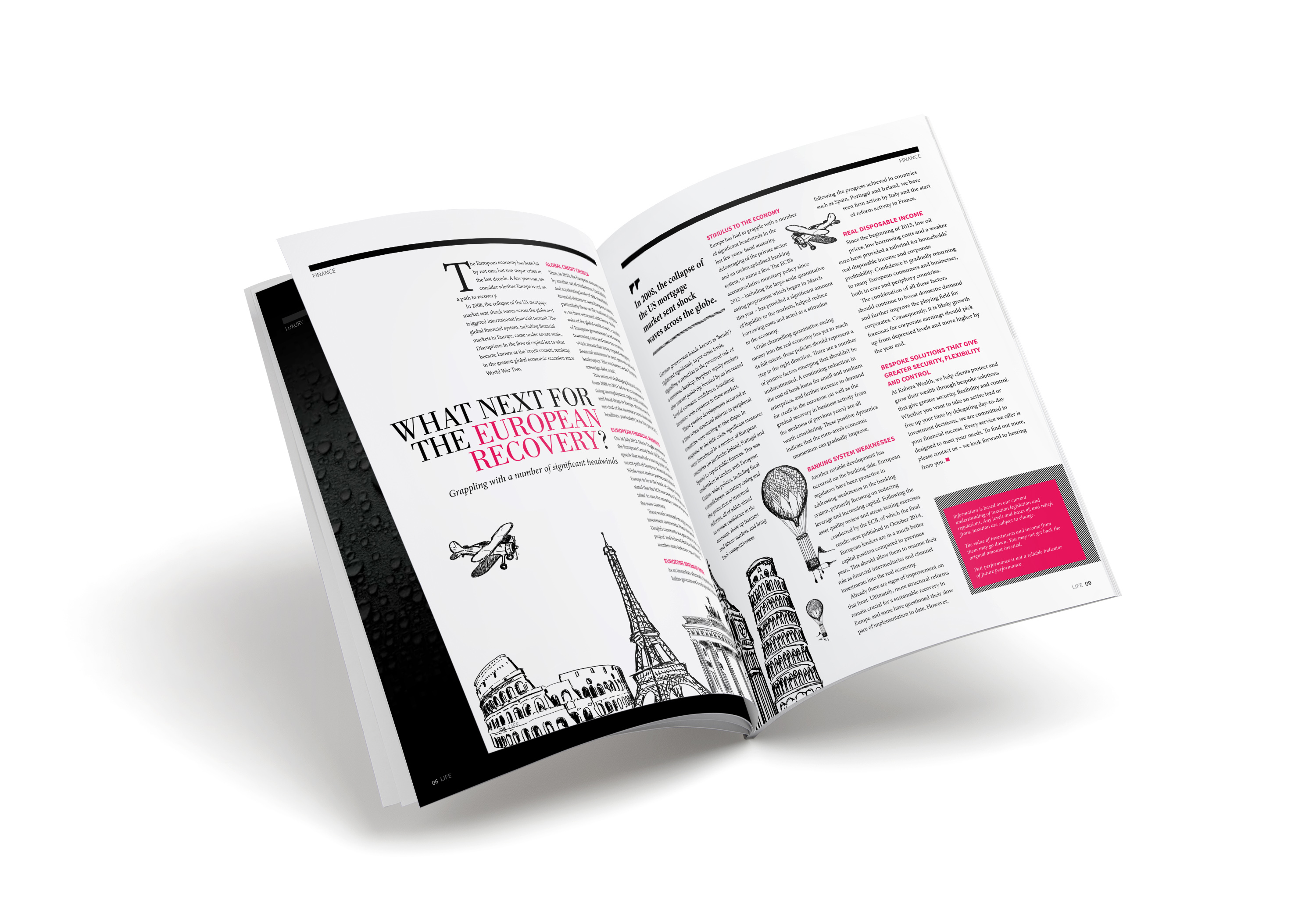
Alfa Would love to see this not in a mock up so we can appreciate the Illustration. Looks great!
Bravo Only comment, and it goes for your earlier post too, Is that I find that double-colour text box a little distracting. It looks like the dark bit was overlay printed as a mistake