Go back
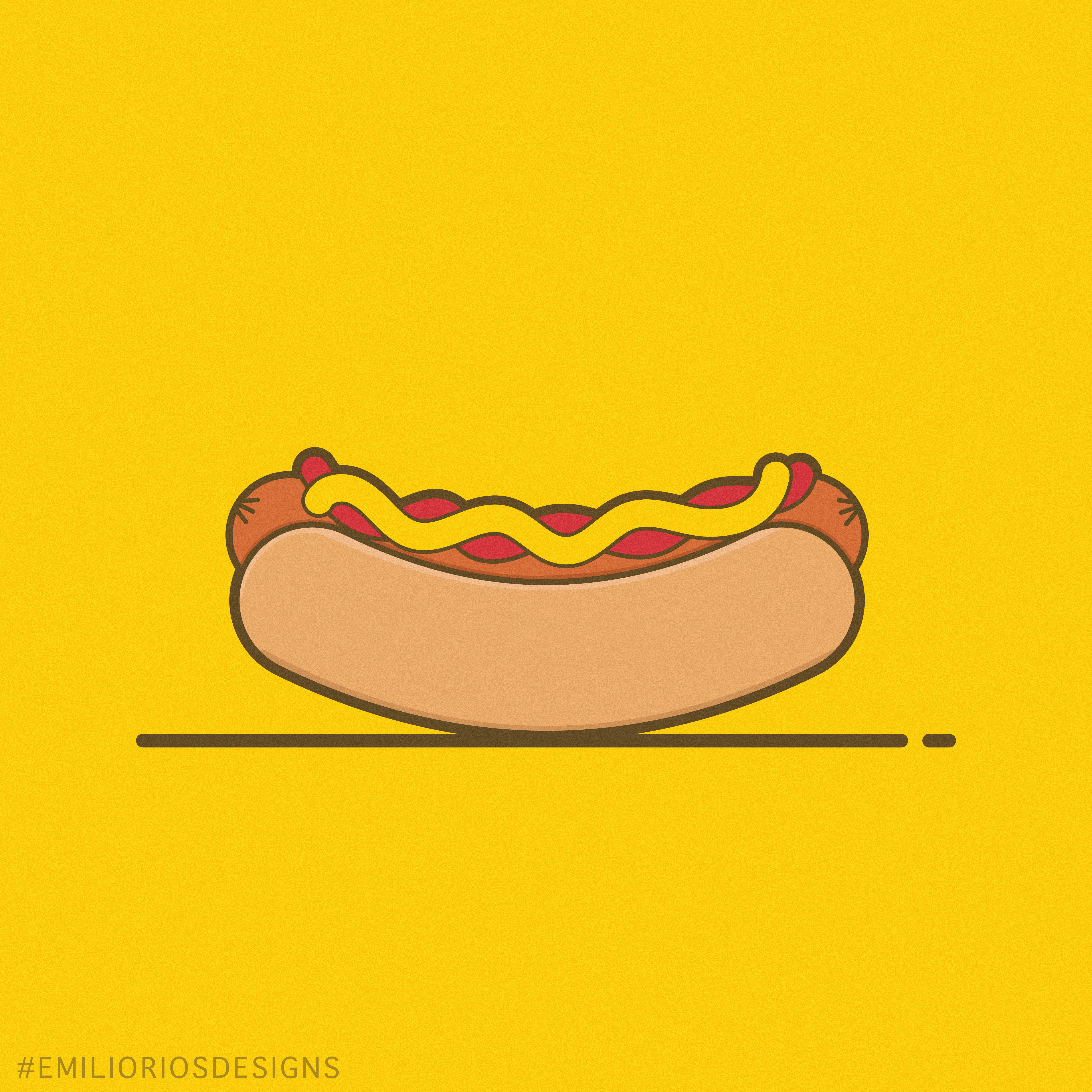
Alfa Yum, mustard looks like it's sliding off a little
Bravo The buns highlight and shadow bothers me personally. This design asks more for a real flat look. Also the outline on top of the ketchup appears to be too thick.
Charlie I agree with bravo, the outline on top of the ketchup and bottom of bun are thicker than the rest of the strokes
Delta the ketchup and mustard should be intertwined