Go back
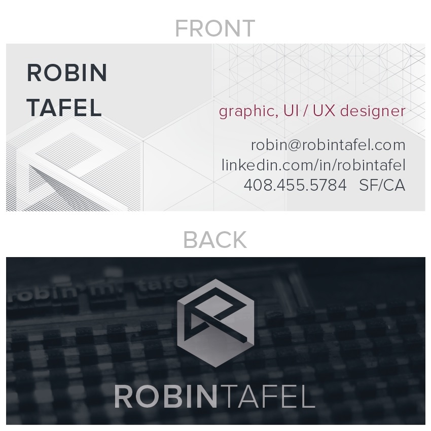
Alfa The front is sweet, the back is meh. Maybe just have the photo, no logo.
Bravo These is a lot wrong with this. Firstly, these are the busiest business cards I've seen in a long time. Did you do any research? The leading on your name on the front is WAY off.
Bravo Where does the red come from? It's not used anywhere else. The mark itself is inconsistent between uses. The treatment of your name is also inconsistent between uses; perhaps use the same treatment on both sides.
Delta I personally like what you're trying to do with the logo. When it's placed over a hexagon it gives a nice illusion of a cube. However, I think it could use some tightening up - the angles of the ends of the lines are all
Bravo The logo is actually fine - it's the rest of it that needs work
Foxtrot I'm agreeing with bravo. Logo is ok. The layout of the business card is not, like bravo already mentioned.
Golf I agree with both bravo and delta. The logo... If you notice in the middle where the two diagonal lines overlap is cut off in inconsistent angles. And bravo is spot on.