Go back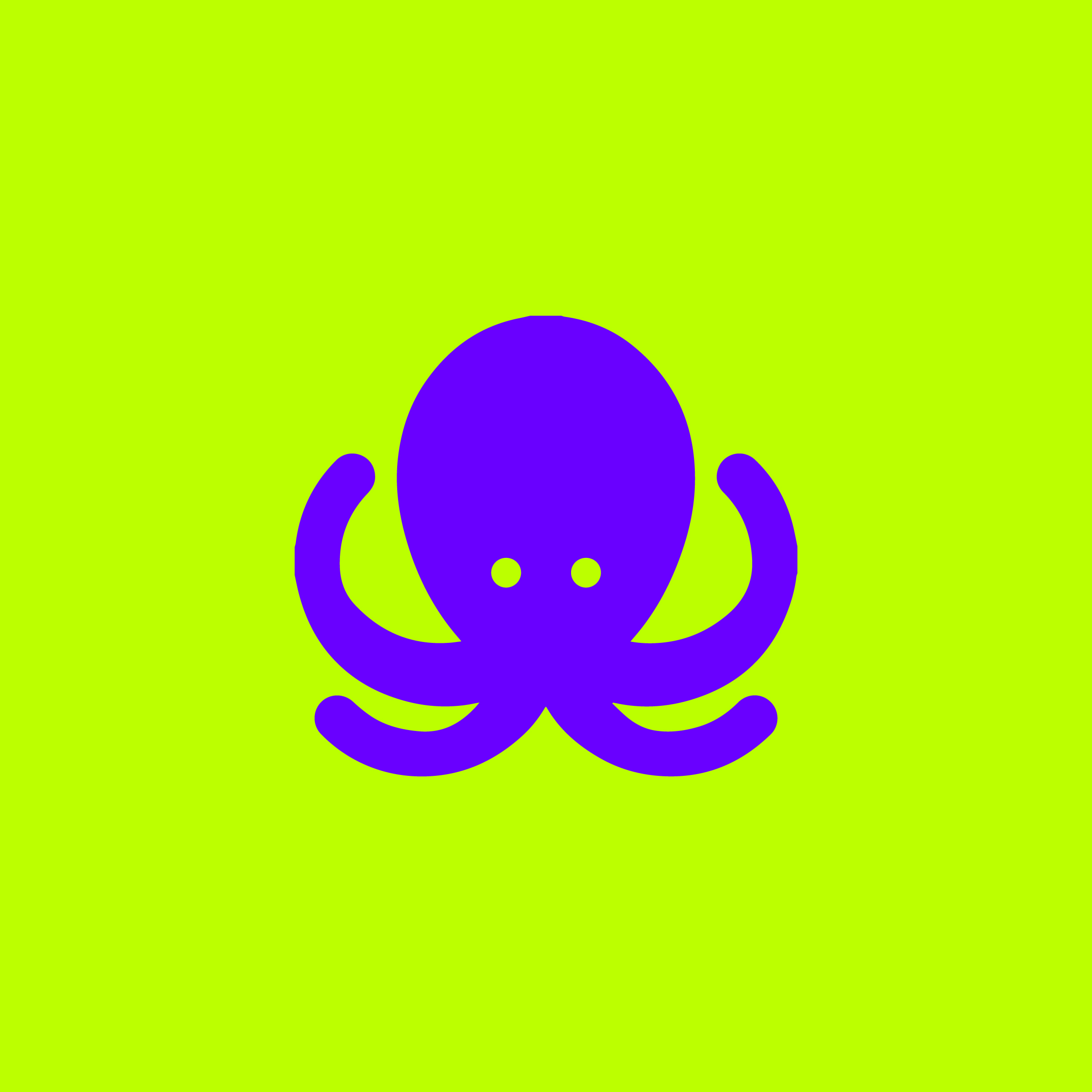
Alfa Colours are a bit flashy imo. But the design is not bad.
Bravo Did someone sever his other 4 tentacles?
Alfa Surrealism is not a bad thing :)
Delta A little less symmetry would make this design more interesting. Also it looks like you added a small effect or something to it. (Drop shadow?) remove that, it will inhance the design.
Echo That's an optical illusion, that's what happens when you put the invert of each other together.
Delta ^"when you put the invert of each other together?" What does that mean? Im am pretty sure an effect was used. I know this 'optical illusion' too well.
Alfa Yes, indeed. A drop shadow or inner glow.
Hotel why don't you try zooming in. That's the effect you get when you put two bright colors that are opposites together.
Delta Dear person above... I zoomed in, still not changing my mind about 'applied effect'. Also i am very aware of color theorie etc. Thanks. ;)
Juliett I like it xoxo girl from the polygon tiger
Delta Ok so since the "polygon tiger" girl gives the thumb up means every other critique is not worth taking into account. Sorry juliett your comment sounds arrogant.:)
Juliett Delta i'm just having fun. It's not because I say who I am I mean I'm the best or something.
Delta Just think about it in the future juliett.
November If you have a look on the website https://iconosnap.com/168 you can actually see there is no "applied effects" on it at all. Its just smart phones making it look like it has some sort of effect on!
Delta Yeah you are right. Good to know.
Echo Told you
Delta Echo you didn't tell me that.;)