Go back
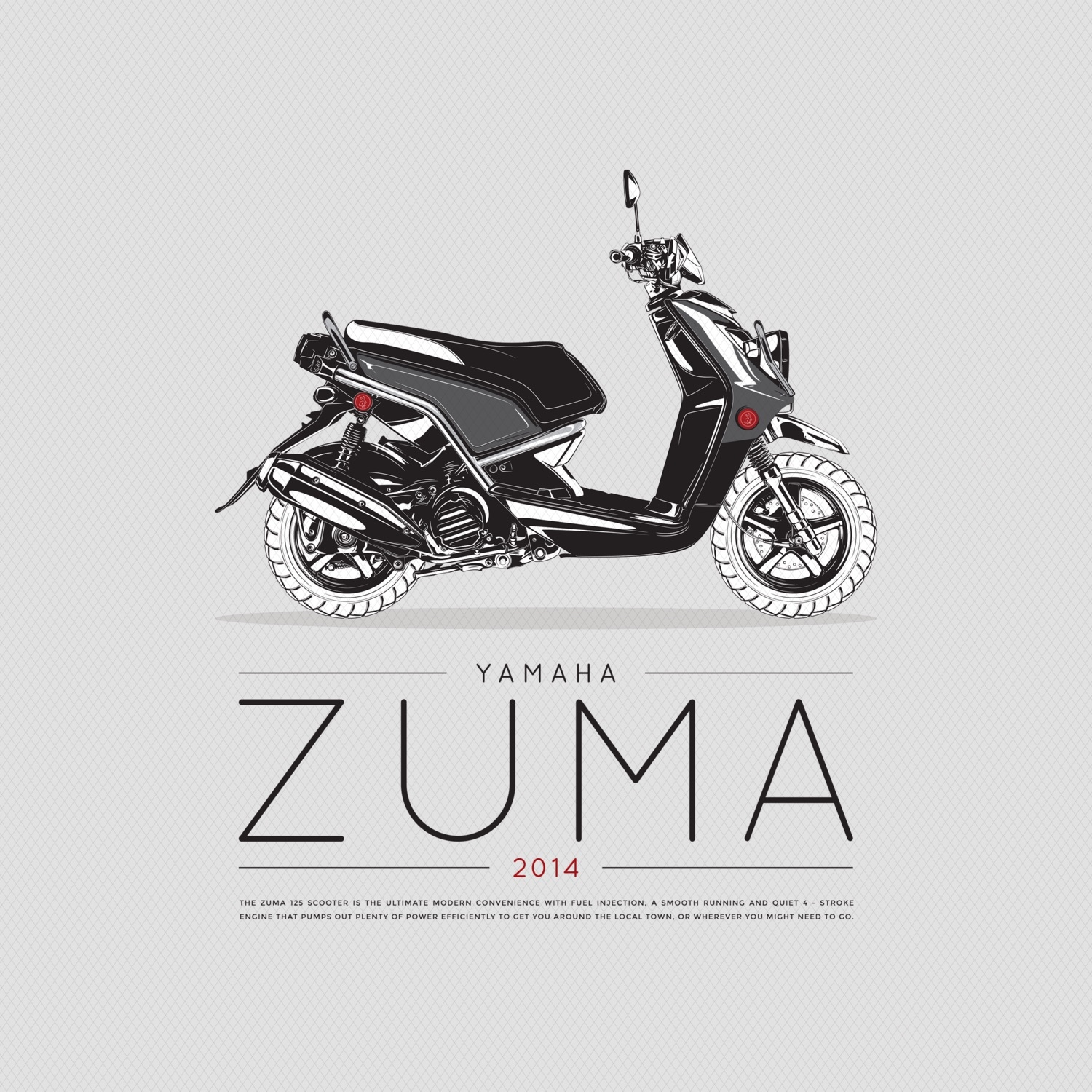
Alfa Illustrated a Zuma for a poster series. Did the layout of the whole thing as well. Let me know what you think!
Bravo Love it
Charlie That detail is impressive
Alfa Thanks!
Echo Love it. I think the copy dominates over the quite exquisite illustration. Perhaps let the illustration lead by making the copy smaller.
Foxtrot Sorry, I know this is a tad late. I love this! But I somewhat agree with Echo. Maybe to accomplish this, you could make the "Yamaha Zuma" part smaller to take up 2/3rds of the width and fill up the other third with a talle
Foxtrot Taller block that has the body copy in a full justified block to the right. Wild love to see the rest of the posters! This looks great.