Go back
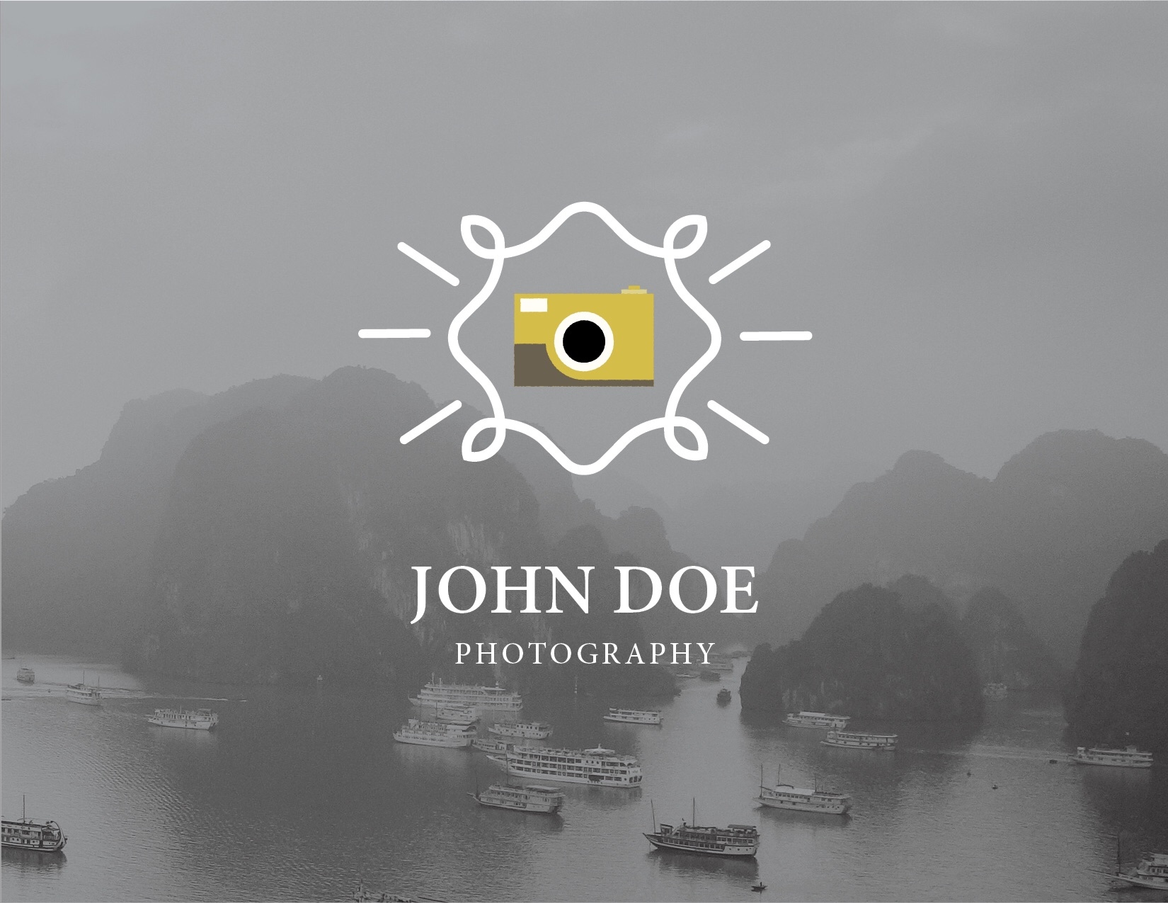
Alfa Logo
Alfa Design
Charlie The type and icon don't really fit
Delta ^ yes what the person above me said.
Echo Nice don't listen to above!
Delta ^silly. The mark as it is right now asks for a san serif type. Or make the mark match the serifs, that would be even more creative.
Golf How does this reproduce one-colour? How do the icon and detailing relate? What does the detailing represent? Is this the right type choice? Needs work
Hotel Needs a ton of work. Above comments are right.
Delta I feel a little dumb for asking, but what do you mean by 'detailing'? Do you mean the photograph in the background? Btw i agree with all critiques.
Golf ^ detailing is the pattern around the camera icon
Delta Ahh ok. Now i understand. Thanks!:)