Go back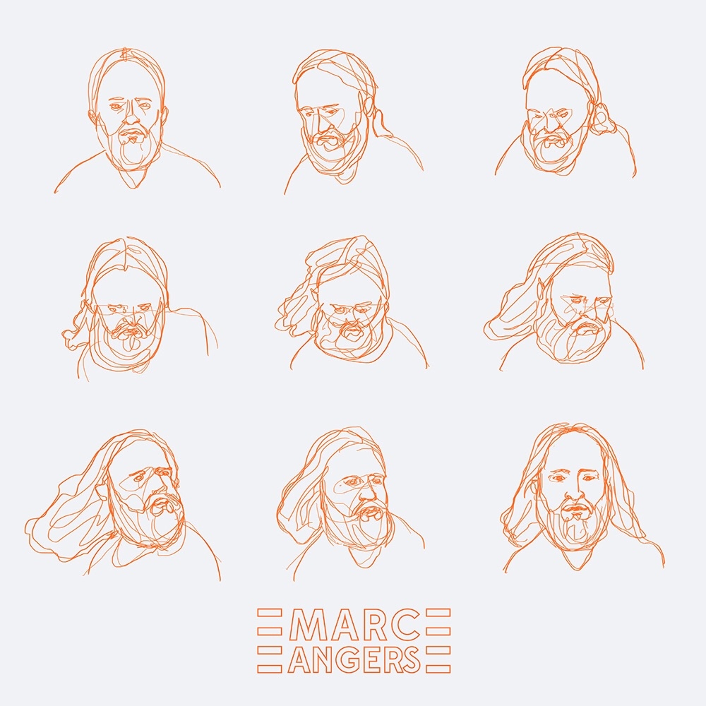
Alfa solid font would be bettee iguess
Bravo Adjust the spacing between letters
Charlie I reckon big solid lettering in the centre, in a different colour and overlaying the illustrations would make for more of an album cover
Delta ^ do you know the music? How can you make a design choice by not knowing anything about the insight? Ps. The illustrations are well executed.
Charlie ^i know that in its current iteration, the type is the weakest part. Maybe my suggestion won't apply, but I'm saying that in my opinion another approach is needed
Delta The type just needs a little bit of 'kerning' attention that's all.
Golf Agreed. Illustrations look great.